Web Design

Subscribe in your email box!

Subscribe in your feed reader!

I try to write about three times per week. Most of it is pretty good and will probably help you grow your business. If it doesn't, then I probably can't help you.

You can use a traditional RSS Feedreader with this fancy-dancy link. I think this approach is harder but if you want to do it the hard way, who am I to say otherwise?

You can use a traditional RSS Feedreader with this fancy-dancy link. I think this approach is harder but if you want to do it the hard way, who am I to say otherwise?

You Think Your Website Has Problems

posted this on Tuesday, November 5, 2013 at about 1pm.
You Think Your Website Has Problems -  Fox News Jon Stewart

My company, Tribute Media, has been building websites and marketing them online for better than six years. We've had clients of all sorts. Those that are spectacular to work with and those who are, well, not so much.

Sometimes we have clients that forget that mistakes happen and it's no use sweating bullets over. They will flip out if there is a pixel out of place. They will struggle to realize that just because something isn't perfect on their website, it doesn't mean that the world has to come to an end.

Sometimes I think they assume that no one could ever screw up so badly and that screaming and yelling is going to solve the problem.

The reality is that tech problems happen. It's not always perfect.

I was checking on the news and FoxNews home page had some problems.

Their Twitter account indicated the following:

oops Fox News

Check out this screenshot of the problem on their home page.

fox news home page oops

Yeah, that's a safe bet to consider it an internal production problem.

So, if your website is down for a little bit of time and things are not going as well as you'd like them to go, don't stress. Even the big boys have problems now and then.

If you have more than occasional problems, maybe CGI Federal built your website and you need to hire a better firm. I have one in mind if you need help.

Corey Smith and his wife are the proud parents of five wonderful children and live in Meridian, Idaho. He is the president of Tribute Media, a Meridian based Web Design & Marketing Agency.

He is the author of two books, "Do It Right: A CEO's Guide to Web Strategy" and "Tweet It Right: A CEO's Guide to Twitter." You can learn more about his books here.

Interested in having Corey speak for your organization? Need help building or marketing your organization? Want to tell Corey how cool you think he is?

Your Web Guy Might Suck...

posted this on Wednesday, July 24, 2013 at about 7am.
Your Web Guy Might Suck...

I've been building websites professionally for about six years. Before that, I spent plenty of time in design, marketing and business.

Over my career in the last 18 years, I've been very careful to make sure that I focus on being the best I can. I've always wanted to understand the nuance of everything. When I was a color systems specialist, I learned everything I could about color. When I studied a foreign language, I memorized grammar books and now that my company builds websites, I focus on understanding what it takes to build great websites.

Sometimes, I'm truly amazed at what so-called professionals get away with. I'm amazed at what designers and developers get away with and consider it a completed project.

Recently I was asked to review a project that was considered technically ready to go live. In about 15 minutes, I was able to identity the 25 glaring items that indicated that the site was nowhere near ready to go live. In fact, the reason it took 15 minutes was because I had to take time to create the punchlist in such a way that the developer would understand why he needed to fix them.

I figured I would take an opportunity to point out the top six things I see on site after site that no self-respecting designer or developer should ever leave out before he considers a web project complete. If your web guy hasn't taken the time to handle these things properly, then he's not done his job.

I recognize there are varying philosophies. I think these six items are basic enough that they shouldn't be missed. If you see an occasional issue, I wouldn't stress. It's a problem when you see a pattern.

Head Information

The head information is information is the code between the head tags. You won't see the code but you'll see some glaring things that will be obvious when you know what to look for.

  • Title Tag - The title is at the top of the browser window. It should be reflective of what is on the page and different from page to page. On very inexpensive sites, you'll probably see this as the same from page to page because it takes time. It should at least be indicative of the website's purpose. Most importantly, it shouldn't be stuffed with too many keywords.
  • Favicon - The favicon is the little icon that you'll see in the brower's url or tab. This is very often forgotten or done wrong. You'll see it missing if it's done wrong (and obviously if it's forgotten).
  • Meta Description - Most search engines don't care about this anymore but when you post to Facebook or LinkedIn, it will auto-pull the description. If it's not done right then you'll get unpredictable results.

favicon and titles

URL Strategy

This is one of my biggest pet peeves. When using a content management system such as Wordpress or Drupal (our favorite) the URLs have a default that is not smart. In Wordress the URL will be elements of the date (/2013/05/01/title) and in Drupal the URL will be /content/title.

The problem is that website navigation is more complicated than that. Your website visitors need to be able to know where they are in multiple ways. The URL is one key way they can do this.

Let me give you an example. In a Drupal website, if you create a default blog post, the blog post will be at http://www.yoursite.com/content/your-blog-title. The problem is that unless you make your blog title have the word of blog in it, no one will know it's a blog. In fact, if you just go to /content (take off /your-blog-title) it might take you to a page that shows all the content on the website. In many situations like this it will take you to a 404 page-not-found error.

For blog posts, your URLs should be /blog/your-blog-title. Then at /blog, you should see a listing of all your blog posts. Your URLs for news posts should be /news/your-news-title with /news being a list of all your news articles. And so forth.

More complex content strategies need more complex URL strategies. Most designers don't consider this at all.

Links and Link Colors

When your website visitors come to your website, they need to know how to navigate. If it's a link, it needs to look like a link. If it's not a link, it shouldn't look like a link. All your link colors should be consistent. You might have different colors for different purposes but once you establish your rule for your website, you need consistency.

A good test is that if you look at your website and can't quickly identify the links on a page then you've done it wrong. Understand, however, there are times when you'll want an exception to that rule. But, you have to know why you are having an exception.

url structure

www Redirect

Back in the beginning days of the interwebs, we started using the www at the beginning of our domains. It really doesn't serve much practical purpose but it's the world we live in. The challenge is when www.domain.com and domain.com don't point to the same place. Not only does this cause problems for the search engines but it has the potential of showing your website visitors two different websites.

Logo Linking Home

It has become a common convention that your logo should link to your home page. When it doesn't link to your home page, your visitors may get frustrated at not quickly finding a way back to your home page.

Top Level Menu Items

Another common convention is that the top-level menu items for drop down menus should link somewhere. People expect that every item in the menu link somewhere. When you leave the top-level menu to just be a place for people to hover over to see the links below them you'll find that some people will have a hard time navigating your website. Use this link as a landing page for the items underneath. Give them a summary so if and when they click they can have a reason to click again.

Bottom Line

I think that the one key bottom line here is that there are simple things that can give your website the polish that can take it from meh to totally acceptable. These things won't fix bad copy or terrible design but at least your website will incorporate some of the key elements that all modern websites should. If your website doesn't have these basic elements, and your web guy doesn't fix them quickly for you, you should probably fire him

Corey Smith and his wife are the proud parents of five wonderful children and live in Meridian, Idaho. He is the president of Tribute Media, a Meridian based Web Design & Marketing Agency.

He is the author of two books, "Do It Right: A CEO's Guide to Web Strategy" and "Tweet It Right: A CEO's Guide to Twitter." You can learn more about his books here.

Interested in having Corey speak for your organization? Need help building or marketing your organization? Want to tell Corey how cool you think he is?

Web Browsers Are Not Created Equal

posted this on Friday, July 5, 2013 at about 7am.
Web Browsers Are Not Created Equal

When I started Tribute Media nearly six years ago, I had to learn how to provide high quality websites to a variety of companies. I had taught graphic design for the web. I had plenty of print experience and had built a few websites for myself but I never had worked in or run a web development shop.

My first websites were mediocre at best. There are a few still in operation today so I guess they all weren't that bad. However, based on the standards I hold my employees to today, they are - how do you say it?

Not Good!

As we hired our first official designer, we approached the web from a print point of view. Part of the reason we did was because of my extensive print background, but also our first designer was primarily a print designer.

I've come to learn with the hundreds of websites that we've built that print is a very different world than web. Six years ago, a very static (print like) website wasn't necessarily a bad thing. Now, websites have to be interactive. Now, visitors expect a website that works properly on the device they are using.

The challenge for designers is that devices are not all created equal. Windows and Macintosh have different capabilities. But, it's more about the web browser you use. Chrome, Firefox, Safari, Internet Explorer and a host of others, all provide variations in how they work. It makes it even harder when just the version number of the browser can make all the difference in the world.

In my book, "Do It Right: A CEO's Guide to Web Strategy", I use the example of televisions to compare the way web browsers function. You have the equivalent of the old black & white to the latest of 3D TV and everything in between. Each allows you a different experience.

What's interesting is that we don't seem to complain that the broadcaster has done a poor job when our TV doesn't show all the colors or show the rich detail. We understand that the limitations are in the TV itself. People don't seem to have that same leniency when it comes to running a web browser that is seven years old.

As a result, we changed the way we show people designs for approval. In the beginning, we would design in Photoshop or Illustrator and then just create an image for them to see. Then, after it was approved, we had to figure out how to make it look the same in all browsers. Now, we very rarely will provide a mockup of a home page design as an image. When we do, we tell them the caveat is that this may look different from browser to browser.

With this new approach, we make the assumption that browsers will be different; we allow for those differences in the way we design our websites. Internet Explorer is different than Firefox. Safari on the desktop is different than Safari on an iPad or iPhone. Chome on the desktop than Chrome on an Android device.

I'm sure over the next few years we'll see new ways that these web browsers are different and they'll continue to provide challenges for web designers. In the meantime, if you hire a designer to build your website, understand that this is why you hire a professional and not cousin Johnny's nephew who is dabbling in his spare time and can do it for you on the side.

It only looks easy because we make it look easy.

Corey Smith and his wife are the proud parents of five wonderful children and live in Meridian, Idaho. He is the president of Tribute Media, a Meridian based Web Design & Marketing Agency.

He is the author of two books, "Do It Right: A CEO's Guide to Web Strategy" and "Tweet It Right: A CEO's Guide to Twitter." You can learn more about his books here.

Interested in having Corey speak for your organization? Need help building or marketing your organization? Want to tell Corey how cool you think he is?

Out With The Old In With The New

posted this on Thursday, June 6, 2013 at about 11pm.
Old Corey Smith Blog

Two years ago this week, I started this new blog. I came up with a design that I was very happy with but then a few months later I realized that it needed a little upgrade because it quickly became my personal branding website and not only my blog.

Over the course of those two years, I have made a few tweaks here and there and have been pretty happy with the result. I've enjoyed the design but I finally figured it was time for an overhaul.

Not only is my website an opportunity for me to write new content but it's also a bit of a test bed for doing new things with our company's web design capabilities.

For example, my old blog was the first mobile responsive design that we put together. Well, I did it but now my company builds most of our sites with mobile responsive design. My first blog post on the subject was Mobile Web Requires Accomodations. I wrote that shortly after I put in the responsive upgrade to my blog in September of 2011. The purpose of that post was to point out how responsive web design works. Of course, the images in that post are out of date now so I might have to write a follow up to it.

I wanted to create a new website that matches the trends that we are currently seeing and I felt I was way overdue for this upgrade.

In the coming posts, I'll spend a little time talking about why I did what I did... including why I chose to build this myself instead of having my team build it for me. Afterall, I'm not a web designer nor a developer. I'm a businessman and a web strategiest.

I'm curious to know what your thoughts on this design is. Please feel free to leave a comment below with what you think.

By the way, this website is designed using Drupal 7. I'll make sure to write a post talking about why Drupal brings some significant power to this website.

Corey Smith and his wife are the proud parents of five wonderful children and live in Meridian, Idaho. He is the president of Tribute Media, a Meridian based Web Design & Marketing Agency.

He is the author of two books, "Do It Right: A CEO's Guide to Web Strategy" and "Tweet It Right: A CEO's Guide to Twitter." You can learn more about his books here.

Interested in having Corey speak for your organization? Need help building or marketing your organization? Want to tell Corey how cool you think he is?

Web Is The New Real Estate

posted this on Thursday, June 21, 2012 at about 9am.

During the real estate bubble, people were leaving their jobs in droves and taking on a function in the real estate industry. New lenders were popping up everywhere and making a fortune. Realtors were being turned out by the armful and only had to say “hi” in order to make a sale. It seemed, during this time, that the only qualifications for being a general contractor was having a pickup truck and a dog.

Then, in 2007, everything started to change fast. Most of those who made the jump that were in the business because it was a good financial move failed because they really weren’t that good at it. They didn’t really know what it took to truly succeed in the business when the business was going down hill fast.

About the same time the economy was taking a dive, I made a bold move to start a Web company. I had spent 15 years in graphic design and marketing. I already had my MBA. I understood technology (my undergraduate is in IT management). Creating a Web company was a natural next step for me. I didn’t think anything of it. The opportunity was there and I seized upon it.

As I worked hard, I experienced explosive growth and I hired a staff to help me. Year over year we have grown quite a bit. I would say that 2011 was our roughest year but we still were up 15%.

I have noticed a significant increase in people leaving their familiar surroundings and entering the Web space. I’ve noticed that people from all walks of life start selling search engine optimization, social media marketing and Web design… apparently because they can’t do anything else.

My three favorites that I’ve seen recently are companies that come from real estate lending, software sales and residential painting.

Nothing says you are qualified to build a Web site, perform search engine optimization and consult on social media like “I couldn’t work in my past field so I started my Web company.” It was this attitude that prompted my blog post last year titled, I Tweet Therefore I Consult.

I’m not sure we are in a Web design bubble but the barrier to entry is low and business can be good. In fact, even those who are very bad at this can make a sale. However, the quality of work will be sub-par.

So, buyer beware. Choose someone with demonstrated experience and save yourself a lot of headaches.

10 Reasons Why Your Website Sucks

posted this on Thursday, January 26, 2012 at about 2pm.
house

Less than 20 years ago, the Web was new. There were really no standards to speak of. The innovators of the world were quick to try their hand at HTML code.

In 1995, I coded my first website. To say the least, it wasn’t anything to get excited about. I was really excited when I figured out how to have a hover affect for a button. I realize now that, even by the standards of the day, it wasn’t even good enough to be called mediocre.

Even with the tools as effective as they are now, I am amazed how many bad websites I see. Most often, the evidence of a bad website isn’t obvious at first glance. Even with the great templates that are available and the ability to build websites without knowing a lick of code, web designers (both amateur and professional) forget key components to website.

For years, people have thought that the Web requires technical ability. To execute on a Web design, it does. But, in fact, it requires a higher level of business and marketing understanding. It requires the ability to look at how the website fits into the overall marketing strategy. This is the reason I wrote my book. Too many people are jumping in feet first into the world of design tactically and ignoring the strategy behind it.

I think there are some key indicators of a poor Web strategy. What’s amazing is how often I see many of these elements on my competitors’ websites, too. Take a moment to look at your website and see how you stack up with what’s expected.

These are in no particular order.

1. No contact information.

It’s not good enough to have a contact form that says, “Email me, I’ll get back to you.” Perhaps if you are an overstuffed organization, you might get away with it but people still want to talk to people. It’s bad enough if I have to browse to your contact page to find your contact info but if it’s not there at all, I hate you.

The fix: Put your phone number and address in the footer of every page. Your phone number in the header is even better.

2. Poor contrast.

When you have a dark background, you should have light text. When you have a light background, you should have dark text. Often, different sections of a website will have different colors of backgrounds. Each of the sections should be checked for contrast. In addition, your background should not compete with your text.

The fix: Make sure that all text on your website is high enough contrast to be able to read.

The default color of a link in most Web browsers is a bright blue… with an underline. Often, designers want to choose a different color for the links. Too often, the links are changed in some areas of the website and not in others. It causes people to not know which is the link if there are different presentations of those links. In different areas on the page, it might be appropriate to have something different (e.g. the main menu links may look different than content area links). Also, too often, links aren’t differentiated enough from the body text so it’s hard to see where the link is.

The fix: Make sure that all links look like links and look like they belong to each other.

4. No clear call to action.

When we are selling to someone face-to-face, history has proven that when you are clear with your expectations, people are more likely to buy. Think of high school when a boy asks a girl on a date. If he asks, “Will you go out with me?” he’s much more likely to get a positive response than if he asks, “You don’t want to go out with me, do you?” When you don’t have a clear call to action, it’s like being timid in your question. If you want an email, ask for it. If you want them to read more, ask for it. Make it clear.

The fix: Decide your primary goal for your website and make the call to that action as clear as possible.

5. Too much information.

When you try to be all things to all people you end up being nothing to no one. You don’t need to demonstrate all the services you offer in the first visit. When you try to squeeze everything into your home page, people will not know what to focus on and you’ll end up losing more than gaining.

The fix: Focus on your core service offerings for key landing pages and let those interested in learning more dig deeper.

6. Blog and/or social media not maintained.

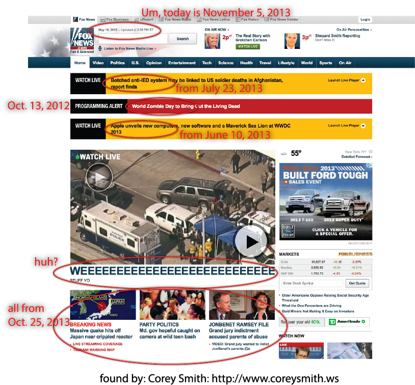
If you are going to have a blog or a social media presence, you had better maintain it. The prompting for this blog post was that I was doing some research on a competitor and found that their blog still has the default Wordpress blog that says, “Welcome to WordPress. This is your first post. Edit or delete it, then start blogging!” The site was built four months ago and it’s still like that. If you are going to put a link to these areas, you better use them.

The fix: Participate or get out. There is no halfway anymore.

7. Horizontal scroll at any screen resolution.

This is when you have to scroll right to left to see the full page. This is harder to manage now because of the smaller screens of tablets and smart phones. But, it’s more important now than about anytime to have this under control. You might consider having a responsive mobile theme (usually my recommendation) or a separate mobile site. But, on standard browsers you should have no horizontal scroll… and turning off scroll bars for your site visitors is not good enough.

The fix: Get a designer that knows what he’s doing — as shown by experience not the regurgitation of platitudes.

8. Typography is not thought out.

Using the standard Web browser defaults for your type is not good enough. Each type of typography needs to be designed. The headers, paragraphs, links, bulleted lists, numbered lists, block quotes, etc. need to be addressed. With the ability to use more fonts now than in the past, unless the standard fonts meet with your brand identity, you should plan on using a newer font and look at each type of text to make it pretty.

The fix: Create a typography set that is fresh and appealing. Test it and test it again. Don’t settle.

9. Ugly logo and graphics.

As I quoted myself in my book, “Whenever I see an ugly logo I think, ‘The CEO must have designed that one.’” Why do we settle for mediocrity? Yes, quality imagery costs more, but not that much more. Don’t settle for the logo designer that charges you a couple hundred dollars. Don’t pick the stock photography that everyone else picks. I understand that Web designers sometimes are limited by the budgets of clients but if it’s your website, pony up a few extra dollars to do it right.

The fix: Get a logo that doesn’t suck. Spend a few dollars more on imagery.

10. No emotion.

Most websites are simply boring. They have no personality. They have no intrigue or interest. They are flat. Bloggers have an advantage here because their own personality can more easily show through. Helping people understand what you believe makes this much easier than showing them what you do. It’s a fine line and is the hardest to overcome but it’s probably the most critical.

The fix: Focus on your why. Focus on telling people what you believe and not what you do.

Subscribe to RSS - Web Design